00%

Graphic Design

Graphic Design

Filmopolis - University Project

Filmopolis - University Project

Filmopolis - University Project

/// Overview

/// Overview

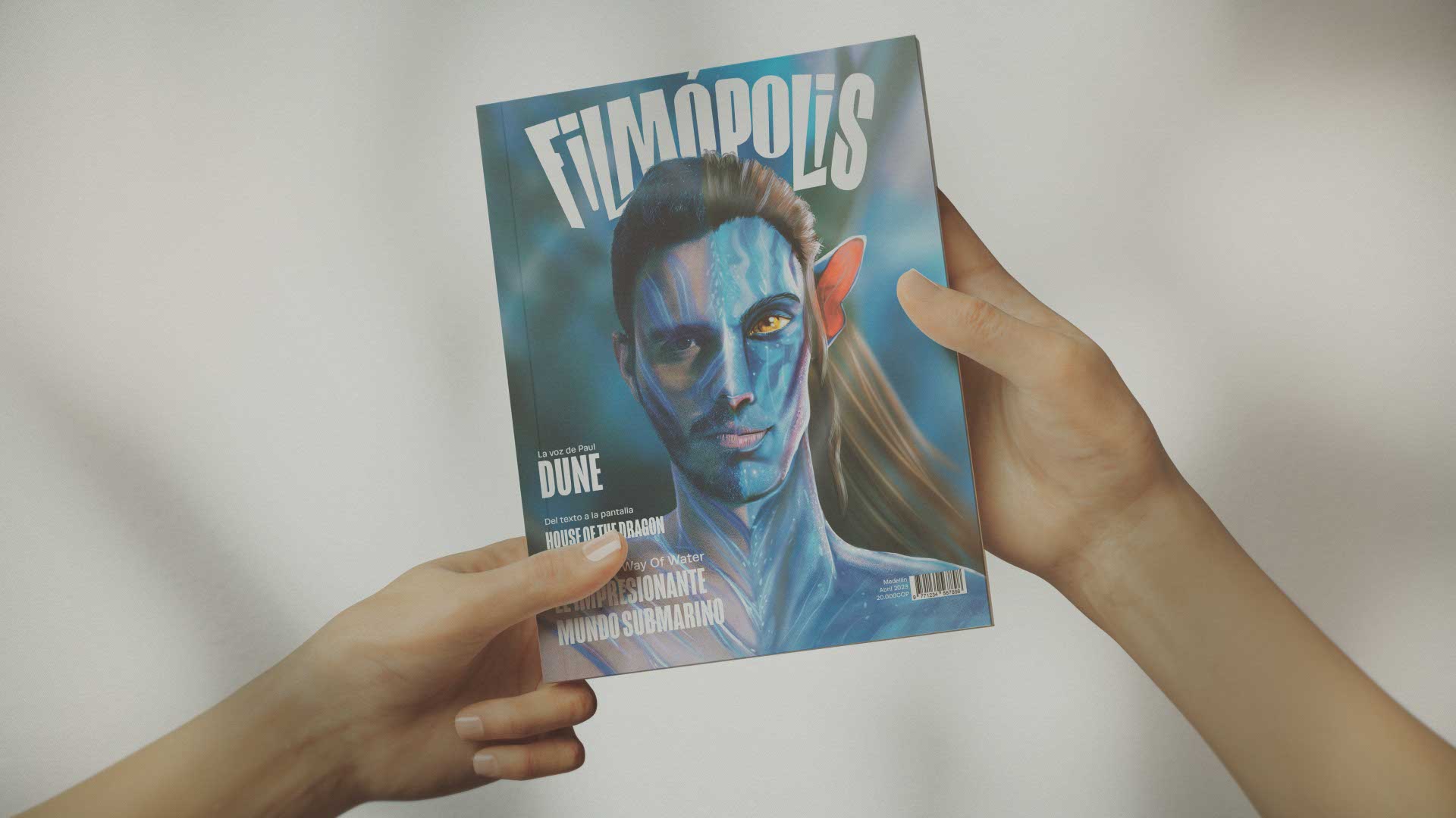
Conceived as a comprehensive academic endeavor, Filmopolis is a bespoke cinematic publication that bridges the gap between high-end editorial design and in-depth film analysis. The magazine serves as a visual homage to modern cinema—ranging from the atmospheric worldbuilding of Dune to the technical aerial feats of Top Gun: Maverick—employing rigorous grid systems, custom vector illustrations, and striking photographic curation to translate the kinetic energy of the silver screen onto the printed page

Conceived as a comprehensive academic endeavor, Filmopolis is a bespoke cinematic publication that bridges the gap between high-end editorial design and in-depth film analysis. The magazine serves as a visual homage to modern cinema—ranging from the atmospheric worldbuilding of Dune to the technical aerial feats of Top Gun: Maverick—employing rigorous grid systems, custom vector illustrations, and striking photographic curation to translate the kinetic energy of the silver screen onto the printed page

// General Information
Role
Lead Editorial Designer & Illustrator
Duration
2 MonthsYear: 2023
Software
Adobe InDesign, Adobe Illustrator, Adobe Photoshop
Credits
Client / Institution: University ProjectCollaborators: Manuela Gómez, Juan José Velásquez (Photography)

/// The Challenge

/// The Challenge

The primary editorial obstacle lay in standardizing a diverse array of cinematic genres and visual languages into a cohesive, singular publication without sacrificing the unique identity of each feature. Developing a modular grid capable of supporting dense typographic hierarchies, intricate infographics, and full-bleed cinematic photography required a delicate balance between structural rigidity and expressive layout design.

/// The Solution

/// The Solution

A robust, variable grid architecture was established, anchored by a sophisticated typographic palette that adapts to the shifting emotional tones of the articles. By integrating bespoke vector illustrations and carefully color-graded photography, the editorial flow was meticulously engineered to guide the reader through analytical essays and technical breakdowns, resulting in a cohesive, premium reading experience that visually echoes the artistry of its subject matter.

/// The Process

/// The Process

I began with extensive structural planning, establishing the publication's underlying grid mechanics and typographic hierarchy to ensure a consistent rhythm across the varied cinematic features. This foundational phase involved deep research into the featured films, extracting core visual motifs to inform the overarching art direction and color palettes for each specific spread. Following the structural lockdown, the focus shifted to the generation of custom illustrative assets and the curation of photographic material, working closely with the photography team to ensure aesthetic alignment. I executed complex typographic layouts, integrating data-driven infographics to break down technical cinematic achievements, seamlessly weaving text and image into compelling visual narratives. The final stage involved rigorous prepress optimization and editorial refinement within the layout software. I meticulously adjusted kerning, leading, and alignment across all articles while calibrating the color profiles for optimal print fidelity, culminating in a polished, production-ready editorial master file.