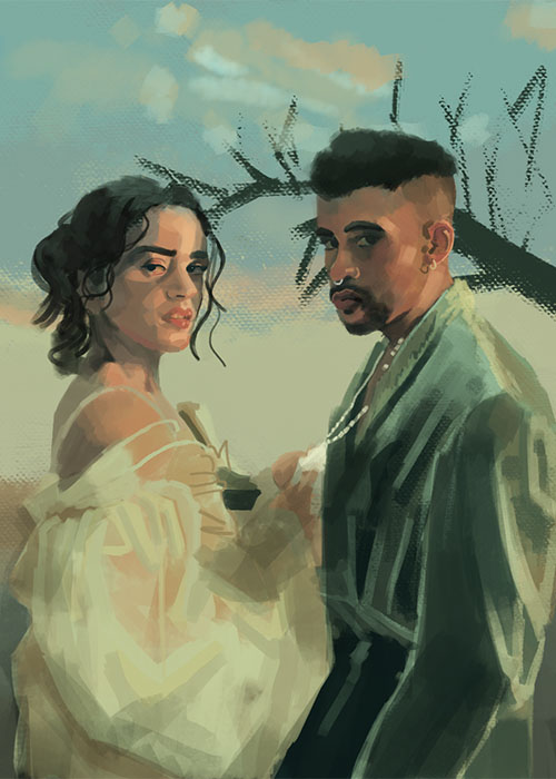
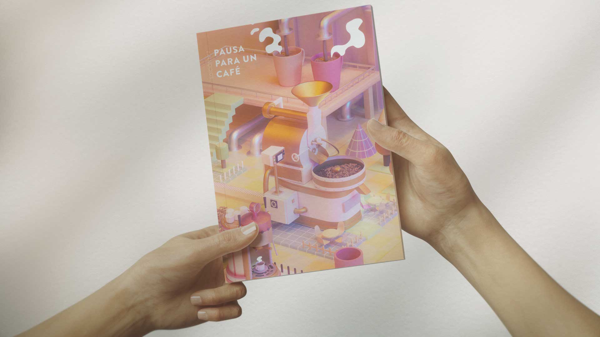
I began with a deep contextual analysis of the Concordia coffee ecosystem, synthesizing its cultural touchstones into a refined mood board and structural grid system. This foundational phase informed the overarching typographic selection and color grading, ensuring strict alignment with the region's organic aesthetic. Following concept approval, I executed the layout and compositional framing for the magazine covers, employing precise image manipulation and vector asset integration to craft visually commanding entry points for the publication. Simultaneously, I adapted this core visual language into a scalable suite of editorial pieces tailored for the 2024 event circuit. This involved translating the high-resolution magazine assets into dynamic promotional formats, optimizing spatial distribution and typographic hierarchy for rapid informational consumption. Final delivery required rigorous pre-press file preparation and asset packaging, ensuring absolute color fidelity and structural integrity across all physical print runs and digital distribution channels. Following the structural lockdown, the focus shifted to the generation of custom illustrative assets and the curation of photographic material, working closely with the photography team to ensure aesthetic alignment. I executed complex typographic layouts, integrating data-driven infographics to break down technical cinematic achievements, seamlessly weaving text and image into compelling visual narratives. The final stage involved rigorous prepress optimization and editorial refinement within the layout software. I meticulously adjusted kerning, leading, and alignment across all articles while calibrating the color profiles for optimal print fidelity, culminating in a polished, production-ready editorial master file.
I began with a deep contextual analysis of the Concordia coffee ecosystem, synthesizing its cultural touchstones into a refined mood board and structural grid system. This foundational phase informed the overarching typographic selection and color grading, ensuring strict alignment with the region's organic aesthetic. Following concept approval, I executed the layout and compositional framing for the magazine covers, employing precise image manipulation and vector asset integration to craft visually commanding entry points for the publication. Simultaneously, I adapted this core visual language into a scalable suite of editorial pieces tailored for the 2024 event circuit. This involved translating the high-resolution magazine assets into dynamic promotional formats, optimizing spatial distribution and typographic hierarchy for rapid informational consumption. Final delivery required rigorous pre-press file preparation and asset packaging, ensuring absolute color fidelity and structural integrity across all physical print runs and digital distribution channels. Following the structural lockdown, the focus shifted to the generation of custom illustrative assets and the curation of photographic material, working closely with the photography team to ensure aesthetic alignment. I executed complex typographic layouts, integrating data-driven infographics to break down technical cinematic achievements, seamlessly weaving text and image into compelling visual narratives. The final stage involved rigorous prepress optimization and editorial refinement within the layout software. I meticulously adjusted kerning, leading, and alignment across all articles while calibrating the color profiles for optimal print fidelity, culminating in a polished, production-ready editorial master file.
I began with a deep contextual analysis of the Concordia coffee ecosystem, synthesizing its cultural touchstones into a refined mood board and structural grid system. This foundational phase informed the overarching typographic selection and color grading, ensuring strict alignment with the region's organic aesthetic. Following concept approval, I executed the layout and compositional framing for the magazine covers, employing precise image manipulation and vector asset integration to craft visually commanding entry points for the publication. Simultaneously, I adapted this core visual language into a scalable suite of editorial pieces tailored for the 2024 event circuit. This involved translating the high-resolution magazine assets into dynamic promotional formats, optimizing spatial distribution and typographic hierarchy for rapid informational consumption. Final delivery required rigorous pre-press file preparation and asset packaging, ensuring absolute color fidelity and structural integrity across all physical print runs and digital distribution channels. Following the structural lockdown, the focus shifted to the generation of custom illustrative assets and the curation of photographic material, working closely with the photography team to ensure aesthetic alignment. I executed complex typographic layouts, integrating data-driven infographics to break down technical cinematic achievements, seamlessly weaving text and image into compelling visual narratives. The final stage involved rigorous prepress optimization and editorial refinement within the layout software. I meticulously adjusted kerning, leading, and alignment across all articles while calibrating the color profiles for optimal print fidelity, culminating in a polished, production-ready editorial master file.